What actually makes a light read as "farmhouse"
Strip the style-board language away and farmhouse lighting is four things:
- Warm light, not white light. This is the single biggest one. Farmhouse interiors are built around warm light in the 2700–3000K range. A cool white bulb in a perfect fixture will read as a dentist's office. Our in-line switch cycles bright → soft → warm neutral, and the warm setting is the farmhouse setting.
- A visible cord or chain. Modern lighting hides its connection. Farmhouse lighting shows it — a fabric cord, a black cord, a chain. This is why the style is unusually friendly to plug-in pendants: what is usually a compromise is here a feature.
- Simple geometry, slightly oversized. Cones, domes, stars, lantern frames. Nothing fussy, nothing with a sculptural flourish. The shape should look like it could have been made in a workshop.
- Aged or matte metal, never mirror chrome. Gold, black, oil-rubbed bronze, brass. Shine is the enemy; a surface that looks like it has been there a while is the goal.
Notice that none of those four is "hardwired". You can hit all four with a plug-in pendant, and if you get the cord run and the colour temperature right, nobody will ever ask where the wiring goes.
The island problem, and why plug-in wins
The canonical farmhouse image is two or three pendants in a row over a kitchen island. The canonical problem is that most islands have no ceiling box above them. Builders run the box to wherever the original plan put the table, and islands get added later.
Your options are:
| Option | What it involves | Reality |
|---|---|---|
| Open the ceiling and add boxes | Cut drywall, run cable from a nearby box, patch, repaint | Hundreds to over a thousand dollars, plus a patch that never quite matches texture. |
| Surface-mount conduit | Run cable in conduit across the ceiling | Works, and in an industrial-farmhouse kitchen it can look deliberate. In a soft farmhouse kitchen it looks like a workshop. |
| Hardwire to a single existing box and fake the row | One fixture, off-centre | The compromise most people make, and it looks like one. |
| Plug-in pendants | Hooks, clip strips, cords to the nearest outlet | Afternoon of work, fully reversible, and the visible cord is on-style rather than off-style. |
The last row is not a lesser version of the first row — in a farmhouse kitchen it is arguably the better answer, because a cord running along the ceiling to the wall is exactly what the style already looks like. You are not hiding a compromise; you are using a feature.
Practically: for an island up to about 6 ft, one pendant centred works. Beyond that, hang two, spaced at roughly the outer thirds of the island, at the same drop. Three is possible with plug-ins and easy to do, but only worth it past about 9 ft. Full measurements and cord routes in the plug-in island lighting guide.
Where a Moravian star fits farmhouse
A Moravian star is not the first thing people picture for farmhouse, and that is worth addressing directly. The look is more often a cone or a dome. But the star earns its place for three reasons:
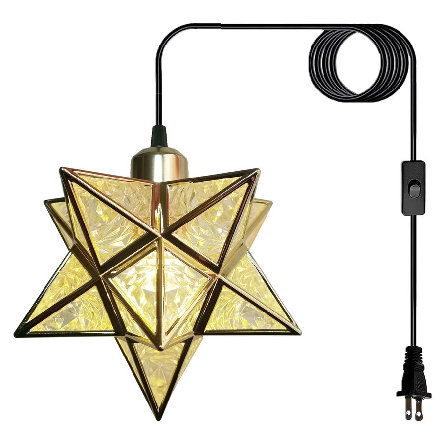
- It has the same geometry logic. 26 points, a simple repeated form, nothing sculptural. It looks made, not designed. The textured gold version especially — the surface has a hand-wrought quality that a smooth dome does not.
- It is a shape with a history. The star began as a geometry exercise in a German boarding school in the 1830s and became an Advent tradition. Farmhouse style leans heavily on objects that look inherited rather than bought. This one genuinely is that kind of object.
- It throws light in every direction. A dome sends light down. A star leaks it through every facet, which is what you want over an island where people stand around the sides as much as under it.
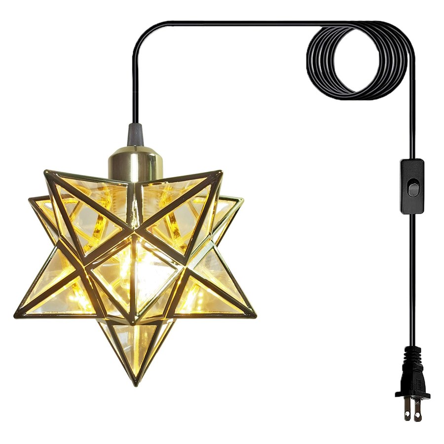
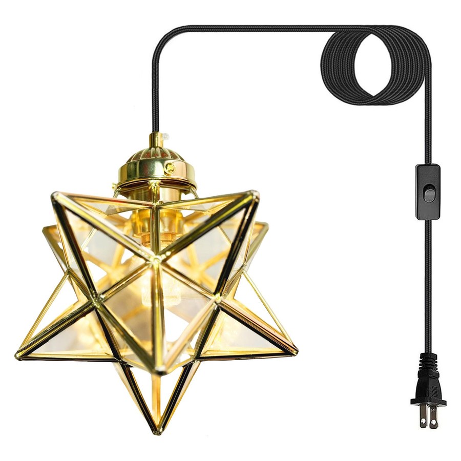
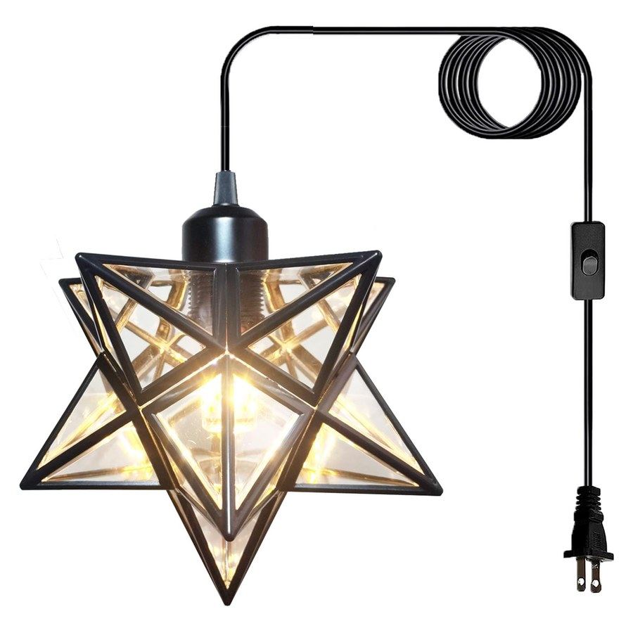
The textured gold farmhouse star is the one built for this: same 7.48 in frame as the rest of the range, but with a surface that catches light like aged metal rather than like plastic. It is the version we would put over an island, and the smooth gold or black versions we would put in an entryway. If you want the whole thing to feel inherited rather than bought, the brass and seeded glass star is the one that does it.
Treat the cord as part of the design
This is the step that decides whether the result looks like a farmhouse kitchen or like a temporary light. On a flat ceiling:
- Up, along, down. Shade to hook, along the ceiling to the nearest wall, down the wall to the outlet. Three runs, two corners.
- Clip every 12–18 in and at both corners. Unclipped cord sags within a week.
- Follow an existing line. The ceiling/wall junction, the shadow line beside an upper cabinet, the edge of a window frame. A cord parallel to a real architectural line stops being visible.
- Keep the runs straight and taut. Farmhouse is not boho — a deliberate swag is fine, a wandering cord is not.
- Do not coil the slack at the hook. Coil it at the outlet end, out of sight, or shorten the run by moving the hook.
Over an island specifically: run both cords to the same wall rather than each to its nearest outlet. Two cords crossing the ceiling in different directions looks accidental; a parallel pair running to one wall looks planned.
Finish choices: gold, black, brass
- Textured gold — the default farmhouse answer. Warm, slightly aged, works with the wood tones and the warm-white bulbs the style depends on. This is the island choice.
- Matte black — the modern-farmhouse answer. Pairs with black cabinet hardware, black window frames and a black faucet. If your kitchen already has black accents, this is the one. It reads as more contemporary and less country.
- Brass with seeded glass — the dressed-up answer. The seeded glass bends light into small points and the brass frame has visible weight. Use it where the pendant is seen close up, over a table or a sink, rather than high over an island.
- Smooth gold — brighter and more decorative than the textured version. Better in an entryway or a bedroom than in a working kitchen.
One rule across all of them: match the fixture metal to at least one other metal already in the room. Farmhouse tolerates mixing, but one shared metal is what makes the room read as designed.
Beyond the kitchen: where else the look works
- Over a dining table — the easiest win. One star centred on the table, warm setting, hung 30–36 in above the top.
- In the entryway — a single pendant over where people stand, with 6 ft 6 in of clearance. The entry is where a farmhouse object reads most clearly, because there is nothing else competing.
- In a corner of the living room — the underrated one. Two walls within a foot means the cord has almost nowhere to travel, and a lit star in a dark corner does more for a room than another lamp.
- Over a mudroom bench or a laundry counter — small spaces where a hardwired fixture would be disproportionate.
Four things that break the look
- Cool white bulbs. The most common failure. Use the warm setting on the in-line switch; if you swap the bulb, stay at 2700–3000K.
- Hanging it too high. Farmhouse pendants sit low and intimate. 30–36 in above the surface, not 48.
- Leaving the cord unclipped because it looked fine on day one. It will not look fine on day ten.
- Trying to hide the cord completely. In this style a neatly clipped, visible cord reads as intentional. A cord stuffed behind a cabinet with a bulge in it reads as a mistake.
Free shipping within the US and a 30-day return window, so you can put one up, live with it for a fortnight and send it back if it is wrong. Two cents of advice before you buy: send a photo of the room to lightsolutionss@outlook.com and tell us your cabinet hardware colour — we will tell you which of the four finishes fits.